
Gilded Glow: Crafting Subtle Opulence with Light
Ambient as the Silk Underlay
Task Light with Discretion
Accent Light that Whispers
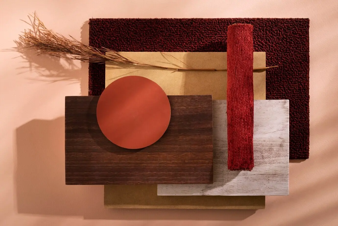
Color, Temperature, and the Truth of Materials
Warmth That Welcomes, Not Weighs
Choose 2700–3000K for living spaces where conversation lingers, yet avoid syrupy yellow by mixing sources with excellent color rendering. Candlelike tones flatter skin and champagne metals, while neutral accents keep marble veining crisp and linen walls creamy, never muddy or dull.
The CRI and TM-30 Advantage
High CRI and thoughtful TM-30 metrics reveal subtle blues in slate, the blush in white oak, and the nuanced greens in indoor plants. When colors read truthfully, luxury feels effortless, because every material expresses integrity without compensation from filters or trickery.
Dimming, Scenes, and the Art of Arrival

Chandeliers that Float, Not Dominate
Sconces as Gentle Guardians

Architecture as Light’s Silent Partner
Cove Geometry That Breathes
Deepen coves enough to hide sources and widen angles, letting ceilings glow like morning mist. Painting reflectors matte ensures softness, while a touch of metallic leaf or pale linen tint adds quiet richness without exposing where the radiance truly begins.
Wash, Graze, and Reveal
Grazing reveals texture; washing enlarges space. Aim from appropriate distances so brick, stucco, and millwork read elegantly, not harshly. Testing at dusk uncovers hotspots early, allowing trims, baffles, or lensing to refine the effect until walls carry a serene luminosity.
Niches, Plinths, and Floating Lines
Line display niches subtly so objects seem self-lit, and let plinths hover with under-glow that never reveals the source. In hallways, a continuous low line provides orientation, welcoming tired eyes and signaling safety with elegance that feels instinctive rather than staged.
Working with Mirrors and Metallics

Candles, Flames, and Safe Magic

Curtains, Shadows, and Gentle Privacy
Stories, Care, and Enduring Brilliance
Maintenance with a Curator’s Eye
Schedule quarterly wipe-downs of lenses, shades, and diffusers so luminous efficiency remains high. Replace failed LEDs in matched groups to preserve color harmony, and note model numbers in a simple logbook, turning upkeep into a graceful ritual rather than a scramble.
Sourcing Responsibly and Beautifully
Seek manufacturers who publish photometrics, service parts, and sustainability commitments. Long lifespans and repairable designs reduce waste while protecting investment. Local artisans add soul, and considered swaps over time allow collections to mature, evolving spaces with patina rather than abrupt reinvention.
All Rights Reserved.